Cosm Cosm

Cosm

Uncategorized

Brick Wall Typeface

Design

Cosm

Work on this page was produced while contracting with Cosm.

My contract with Cosm spanned for the duration of their 2022 rebrand due to their increased need for design during this period. Works below include brand identity, event collateral, technical documentation, and venue visualization.

Cosm is an immersive entertainment, media, and technology company building “shared reality” venues, which are large-format LED domes where audiences watch live sports, concerts, and other content together. The company grew from planetarium leaders Evans & Sutherland and Spitz, Inc., whose hardware and software helped them develop modern dome experiences, and they have since acquired C360 and LiveLike VR.

To introduce the company a bit more, I’ve found two videos that do a great job at introducing Cosm. Although I didn’t work on the first video, it was created by my team during my time there, and discusses the history of the company, and the second was posted by Dan Povenmire (The creator of Phineas and Ferb) and shows where the company is now going.

@experiencecosm

Cosm History: From 1947 ➡️ 2022 and beyond! Cosm was born from the fusion of some of the greatest innovators in the history of technology. Cosm company @E&S and Spitz, Inc. pioneered the first widely used planetarium thanks to Armand Spitz! 🌎 Can you guess what our next big accomplishment was? #Planetarium #Science #ESHistory #Cosm #ImmersiveTechnology #HistoryMatters #STEM #stemhistory

♬ original sound – Cosm

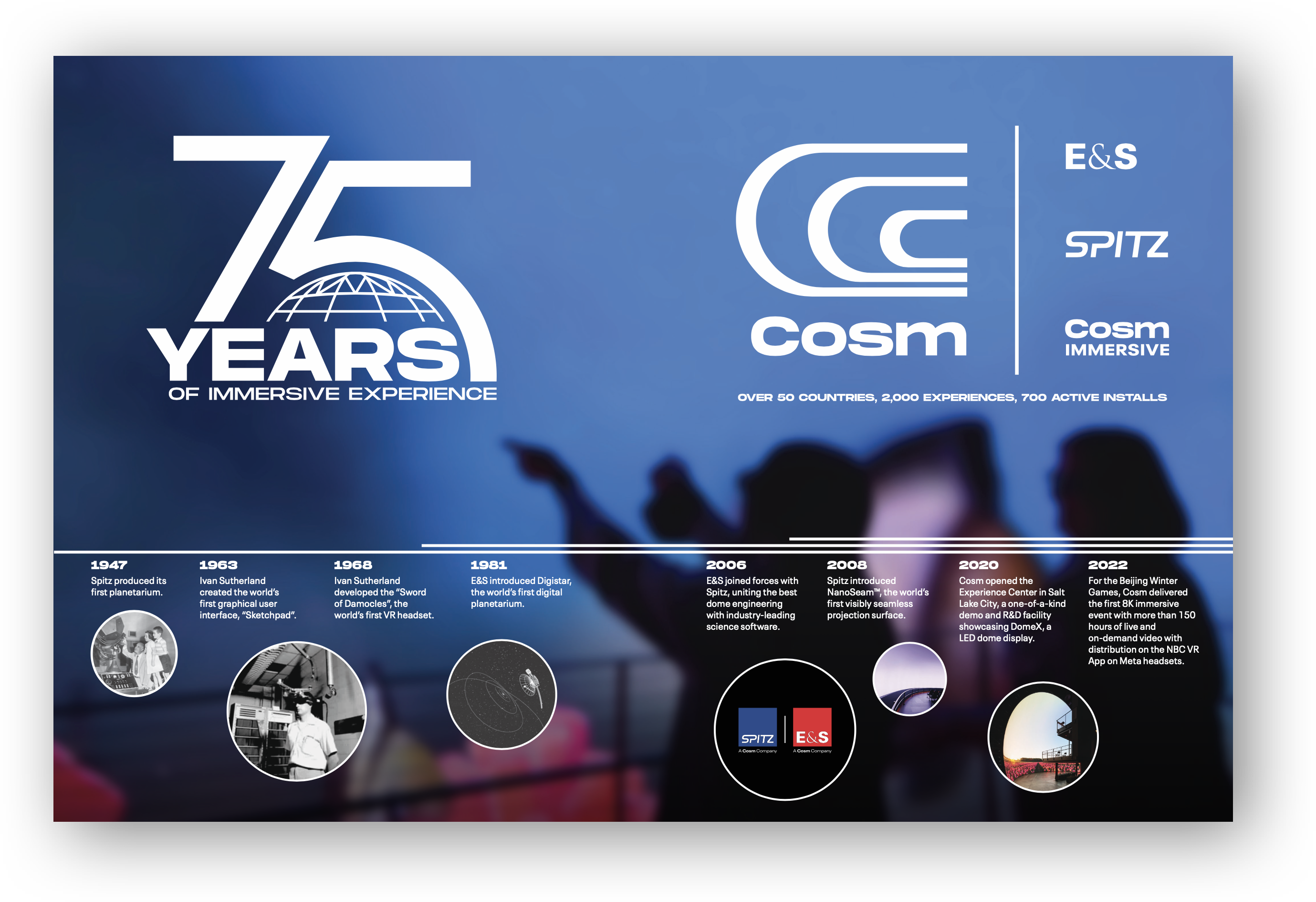
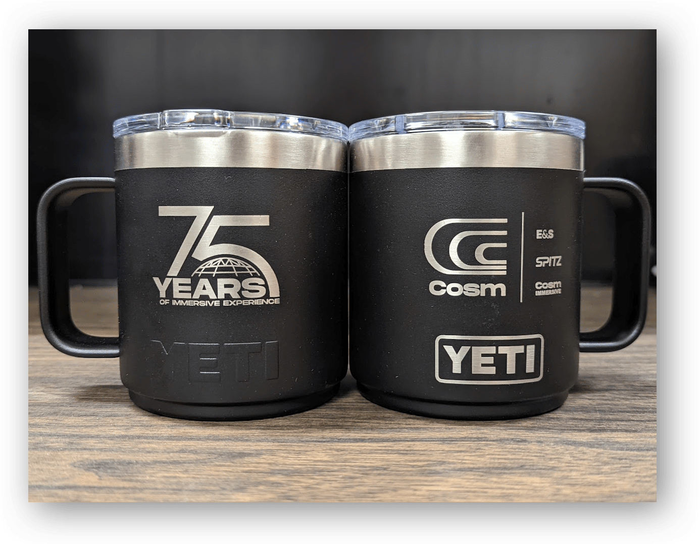
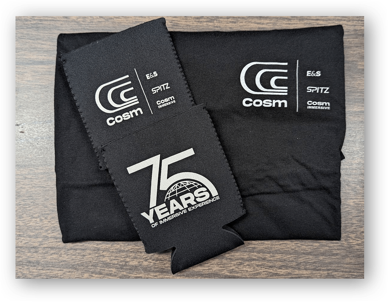
Spitz 75 Year Anniversary

Objective

Spitz Inc. is the oldest company that Cosm’s has acquired, with some employees who have spent decades there. This project aimed to celebrate Spitz employees’ contributions and make the acquisition feel good, while also aiding in the transfer of brand equity to the larger Cosm brand during their rebranding. We needed a unifying anniversary mark to rally employees and partners, and transfer Spitz’s brand equity to the parent brand across internal and external deliverables.

A large "75" with a gridded dome beneath it. In whole, it says "75 Years of Immersive Experience"

Iterations & Research

I explored dozens of iterations before landing on a Lubalin-esque “75,” with “Years of Immersive Experience” set in Cosm’s brand font below. Yet it still lacked a clear nod to Spitz. Spitz is the branch of Cosm tied to dome architecture and has built major planetariums worldwide. Researching their dome-architecture legacy, I studied construction photos and beam patterns, then entirely redrew the “5” to nest a dome inside it.

Outcome & Response

The dome detail mirrors a real beam configuration used in Spitz dome architecture—something the team recognized immediately. As with all acquisitions, some of the Spitz employees were worried about the acquisition, but this detail signaled their work was seen and respected by their new parent company. It was used across email newsletters, external promotional materials to Spitz’s long-time business partners, and merch which was given to all employees.


Venue Use Cases Renderings

Concerts – Featuring Charming Liars

These were created prior to any Cosm venues being built. Other than the company’s own small testing facility in their headquarters, there was no imagery to show the use cases of a full-sized venue. We needed a clearer way to communicate the venue’s versatility to partners and the press. I was given some use cases and a set of neutral interior renders with blank screens. From there, I created and composited all screen content, then adjusted lighting and color grade to match each scenario. In the end, these were used across pitch decks, press outreach, and partner-facing materials, helping convey vision and the variety of experiences to people.


Trade Show & Event Collateral

Trade Show Postcards

All cards were designed first and foremost for clarity: attendees could quickly understand its purpose and what to do if they were interested. They include very clear, simple language, and a direct CTA to scan the QR code. The Digistar 7 card leads to a landing page tailored to the event (which is updated yearly), the GSCA Card links to Cosm’s homepage, as it was intended for people who missed the trade show as a first-time introduction to the company, while the recruitment card links to Cosm’s careers page.

Postcard Front
Postcard Back
Postcard Front
Postcard Back
Postcard Front
Postcard Back

Conference Backwall

This booth backwall was designed as a flexible backdrop that could anchor multiple trade shows. The visual system split into modular messaging zones, allowing for varied configurations by event. I designed the wall layout, prepped assets for production, and built a 3D render for internal preview needs.

3D Render:
Postcards on a Table and the Backwall


Conference Backwall

The pull-up banners were designed to serve as additional brand anchors at trade shows, focusing on products rather than the company. The first set of banners was presenting their Cosm X Solutions suite of services. The other banner focused on Cosm’s NanoSeam dome surface, using a close-up product image to show its detail and precision.


Artemis I Livestream Troubleshooting Guide

I created a skimmable troubleshooting guide designed for over 125 planetariums which were livestreaming the Artemis I launch. This was distributed by Cosm as part of the global simulcast and helped venue teams respond to any technical difficulties they faced while streaming.

Brick Wall Typeface

Overview

This modular display typeface treats each letter as a structural unit, stackable, repeatable, and built to fit together like bricks in a grid. The project began with an exploration of the phrase “wall of text,” imagining how text could take on the physicality of a built wall.

Later, Pink Floyd’s Another Brick in the Wall became a reference point for the name, tying the idea of modular letters back to imagery of walls, especially those in the process of being built up and torn down. As a result, most visual representations of the font throughout this page will be using inspiration from that album. There is also a text box for you to test the font towards the end of this page.

Objective

The goal was to create a typeface where enough characters together would look like a wall of brick. Each character operates as a couple bricks, forming dense, unified text blocks with rigid internal logic. The result is a display system that can function both as typography and as a graphic texture.

Brick Wall type specimen poster available for free download here:
Download at 18″ x 26.5″ | Download at 11.5″ x 14.75″

Design Approach

The project began with me looking through monogram sketches from an old high school project. I found an experimental sketch combining my initials, A and K, which interlocked diagonally and formed two perfect squares that were tilted to form an infinity-like silhouette. I realized that the heavy columns and thin crossbars could be applied to other letters to make them fit a similar mold. This concept expanded into a full type system exploring how letters could fit within a fixed modular grid. Early shapes were explored in Illustrator before building the entire glyphset in RoboFont. Final mockups and visual presentations were created in Illustrator using the exported font files.

System & Variants

The underlying grid system defines each letter’s structure and spacing. It uses a structure of two thick columns, separated by a thin one to create each letter. The thick columns are connected by thin strokes at the top, middle, and/or bottom, with rounded or pointed corners as needed for legibility, balance, and style. This modular logic allows letterforms to adjust while remaining locked to the overall system.

However, you may wonder about letters that wouldn’t fit into this two-column structure cleanly. Letters like W, M, I, and T might do better with one or three columns. And yes, W, M, and I were treated probably as you would expect, but T was approached in a different way compared to the other letters.

The T was creating weird negative space below it when crafted to fit three columns. And when crafted to fit just one, it felt so much like an I that that version was scrapped. I landed on creating three variations:

  • A primary form with the top bar extending left.
  • An alternate with the bar extending right for specific word placements.
  • A full three-column variant with the bar extending both directions, just in case it had letters on each side that could fill the negative space.

This ensures that even irregular letters integrate seamlessly within the typographic wall. Additional alternates are included to keep negative space consistent across varying letter combinations and placements.

Technical Details

Brick Wall is an all-caps display typeface built in RoboFont, with coded alternates to automate contextual alternates and system refinements.

feature calt {

# — Rule 2: t or T between L/l and J-family → T.alt3 —
sub L t’ J by T.alt3;
sub L t’ j by T.alt3;
sub L t’ J.alt2 by T.alt3;

sub l t’ J by T.alt3;
sub l t’ j by T.alt3;
sub l t’ J.alt2 by T.alt3;

sub L T’ J by T.alt3;
sub L T’ j by T.alt3;
sub L T’ J.alt2 by T.alt3;

sub l T’ J by T.alt3;
sub l T’ j by T.alt3;
sub l T’ J.alt2 by T.alt3;

# — Rule 1: t or T followed by J-family → T.alt2 —
sub t’ J by T.alt2;
sub t’ j by T.alt2;
sub t’ J.alt2 by T.alt2;

sub T’ J by T.alt2;
sub T’ j by T.alt2;
sub T’ J.alt2 by T.alt2;

# — Rule 3: J-family preceded by T-family → J.alt2 —
# Covers plain t/T
sub t J’ by J.alt2;
sub t j’ by J.alt2;
sub t J.alt2′ by J.alt2;

sub T J’ by J.alt2;
sub T j’ by J.alt2;
sub T J.alt2′ by J.alt2;

# Covers substituted Ts (chaining)
sub T.alt2 J’ by J.alt2;
sub T.alt2 j’ by J.alt2;
sub T.alt2 J.alt2′ by J.alt2;

sub T.alt3 J’ by J.alt2;
sub T.alt3 j’ by J.alt2;
sub T.alt3 J.alt2′ by J.alt2;

@LettersUpperNoL = [A B C D E F G H I J K M N O P Q R S T U V W X Y Z];
@LettersLowerNoL = [a b c d e f g h i j k m n o p q r s t u v w x y z];
@LettersNoL = [@LettersUpperNoL @LettersLowerNoL];

# t/T → T.alt3 when before . or , AND preceded by L/l or . or ,
lookup T_before_punct_alt3 {
sub [L l period comma] t’ [period comma] by T.alt3;
sub [L l period comma] T’ [period comma] by T.alt3;
} T_before_punct_alt3;

# t/T → T.alt2 when before . or , (general case)
lookup T_before_punct_alt2 {
sub t’ [period comma] by T.alt2;
sub T’ [period comma] by T.alt2;
} T_before_punct_alt2;

# t/T → T.alt2 when followed by space AND preceded by a non-L letter
lookup T_before_space_after_nonL {
sub @LettersNoL t’ space by T.alt2;
sub @LettersNoL T’ space by T.alt2;
} T_before_space_after_nonL;

} calt;
feature ss01 {
sub T by T.alt2;
sub t by T.alt2;
} ss01;

feature ss02 {
sub T by T.alt3;
sub t by T.alt3;
} ss02;

feature ss03 {
sub J by J.alt2;
sub j by J.alt2;
} ss03;

One of the better examples of how this can function is the letter series LTLTJTJ. All of these contain gaps which may not be desired when displayed often in a wall of text.

So the solution was to automate the changing of these glyphs to fit together more snugly. One issue however, was the letter J was looking odd when next to the letter T. The subtle connection between the tops of the letters made them appear like one strange character.

Instead of that, I cut off that part of the J, but only in the situations it’s next to a T. This led to the LTLTJTJ sequence from above condensing to the following:

This is just one pretty comprehensive example of the way this font was programmed to adjust. More interactions are planned with punctuation and alternates for the font’s final release in a couple of months.

Conclusion

While originally built as an experimental display typeface, it now stands as a functional system ready for practical use in posters, album covers, or any context where text is treated as both communication and graphic element. Final refinements will focus on additional punctuation and glyphs, as well as any necessary programming for the new additions before it is released publicly.