
Hestia / Loci
Hestia / Loci
I used one product brief to build two brands with different names, voices, interfaces, and audiences.
architectural

infrastructural
The same device, dressed two ways.
Both brands sell one piece of hardware. The split is in how it is presented: Hestia leads with the object in a room, Loci leads with the object as equipment. These are the product renders behind each pitch, away from the websites.

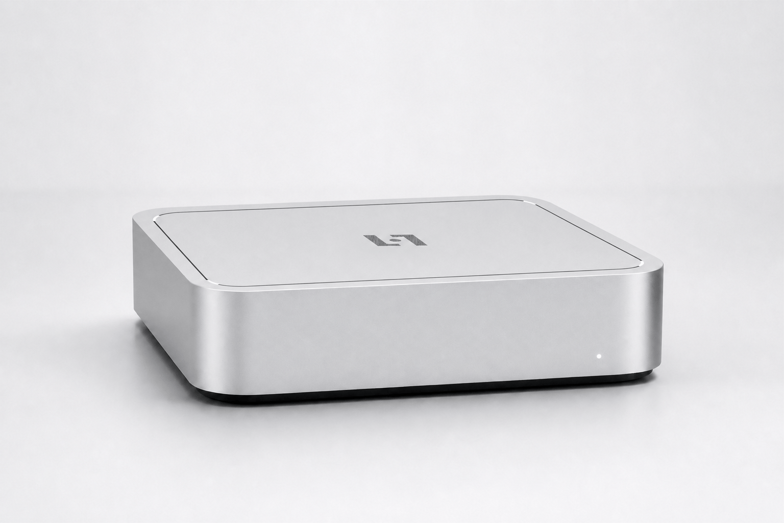

Same product, different pitch.
Local-first
Place-bound knowledge
Role-aware access
Configured deployment
Both sites describe a small local device that stores the information attached to a home, building, rental, or shared space. I kept the product idea, early-access offer, installation model, and basic capabilities fixed.
I changed the name, copy, materials, page order, and product demonstrations. I wanted to see whether the same device could read as something domestic and reassuring in one version, then technical and inspectable in the other.
The digital “center” or “gathering space” of a physical location.
For Hestia, I started with the hearth. The dark palette, serif type, amber status light, and slower page rhythm make the device feel at home in a residential or hospitality setting. The copy talks about memory and continuity before it explains the technical setup.
Context has a location.
For Loci, I moved the interface and system diagram forward. The grid, mono labels, silver hardware, and role-based demo show how information moves through the product. The page explains the tool first and leaves the atmosphere to the details.
The clearest difference, other than the visual approach, was the order of information.
Hestia opens with a feeling, then explains the product. Loci opens with the product and lets the personality appear through its controls, diagrams, and hardware. Building both made the audience split much easier to see than it was in the original brief.