
Universal Processing
Universal
Processing
Work from my time at Universal Processing, focusing on the rebrand I led for the company.


Before the rebrand
My work began inside the existing Universal Processing LLC identity. Before the rebrand, I designed emails, social posts, web pages, event materials, and company decks within its established visual language.
Using that system every day made its limitations clear. Years of the brand being twisted and changed in so many ways had diluted its systems and its clarity. One goal of the rebrand was to reel things back in, so we did not have 12 different shades of blue, randomly selected other colors, and 8 different sans-serif fonts all in use at once.



Leading the rebrand
Leadership had already brought in an outside agency to run the rebrand, and by the time I was involved they had been working on it for months.
The agency had already set three things: the tagline, “Let’s Go UP!”; the web domain, letsgoup.com; and the name of the philanthropic branch, uPhil. Its first visual proposals came back rushed and under-resolved: generic ideas, uneven geometry, and colors that had not been considered.
Leadership asked me to take over the visual development in-house. I led it from July to November 2023, bringing the other designers into the refinement rounds.
An obvious upward arrow took dozens of iterations.
The arrow was the immediate idea. The harder part was turning it into a mark that felt specific to Universal Processing, tied to the company’s purpose of helping small businesses grow, especially in underserved communities. Even with the arrow as the obvious answer, I worked through dozens of other directions first, to be sure there was nothing better.
Upward arrow
The name made upward movement the natural starting point.
Narrowing the field
I worked through dozens of constructions, refining the letterforms and the geometry on each pass.
Craft mattered
Each round tightened symmetry, joins, proportions, and how the U, P, and arrow read together.
The company voted
Leadership’s vote tied, so the choice went to the full company.
Studies from the two working files, September and December 2023.
Tree / direct arrow
Bamboo / cultural origin
The executive team split evenly between a tree that read more directly as an arrow and a bamboo direction that also referred to the company’s roots serving Asian immigrant communities.
A company-wide vote broke the tie. The tree direction shown here won.


The logo was one part of a brighter, warmer fintech identity.
Mark
The new symbol kept the U, the P, and the blue. Otherwise it deliberately broke from the old chat bubble mark.
Color
I retained blue, selected a more intense shade, and added green for finance, money, and growth. I compared options, ran surveys, and consulted designers at other agencies before fixing the palette.
Type
The logo uses custom lettering designed to work with the rebrand’s rounded primary sans-serif. The friendlier forms were a conscious contrast to the sterile tone common in finance.
Brighter on purpose.
Blue and green are common in fintech. I pushed both shades to be more noticeable and more optimistic than the muted blues and greens of the traditional institutions. That mattered for who we were talking to: a lot of our small business clients had bad experiences with those larger institutions, and the palette had no reason to borrow their tone.
The standards site turned the rebrand into a usable system.
I built a shared reference for the logo, naming, color, typography, and common applications using Standards.site. The original guidelines are no longer publicly available, but the team is still working from them.
Universal Processing’s own account of the change.
Universal Processing’s brand-history article places the 2024–present mark in a longer company timeline and describes the move toward a clearer, more independent full-service provider.
Read Universal Processing’s brand-evolution article ↗The rollout
The identity was finished in November, which left the harder question of how far it had to travel before anyone inside or outside the company would treat it as real. Everything the company already had in the world still carried the old brand, and an identity that only exists in a deck does not change that. So I scoped the rollout wide: anything a customer was handed, anything the offices put up, and anything we published under our own name.
Developing it in-house also cut the company’s reliance on the outside agency’s support, which saved over $80,000. I was promoted to Lead Graphic Designer shortly after the launch.
The company announced the new identity for the first time at the 2024 gala.
The launch was staged at the company gala in February 2024, at Glasshouse in Chelsea. Guests arrived for a cocktail hour on the twenty-first floor under the old identity, then moved down to the fourteenth floor for the presentation and dinner. Partway through the presentation, the deck transitioned and the rebrand was announced to investors, industry executives, and business partners in the room.
While dinner ran on the fourteenth floor, the marketing team who produced the event changed over every piece of decor upstairs. When guests returned to the twenty-first floor for the afterparty, the old brand was gone and the new one was already in place.
That sequence made the difference visible without a long explanation. I had completed the identity in November 2023, and it stayed inside the company until the gala three months later.


I applied the identity across everything the company produced.
Once the identity was announced, it had to appear everywhere: the website, the packaging the terminals shipped in, the Dejavoo Z8 user manual that went in the box in English and Chinese, the merchandise handed out internally, and the uServe backwall for the trade show stand. All of it is post-rebrand collateral, so all of it sits together here.
letsgoup.com
I handled the UX, visual design, and development of the rebranded website in WordPress and Elementor. I brought in outside writing help where I could. Some of the website has changed, but the original structure and design system are still in use.


Dejavoo Z8 user manual
The manual shipped in the box with the terminals, in English and Chinese. The 2023 edition is at the top of this page in the old identity, which makes this the clearest before and after here: the same document, rebuilt in the new system.
Loading the manual
Terminal box insert
This went in the box with every terminal. It is a top-fold card: the mark on the front, and inside a thank-you letter with a QR code for leaving a review.
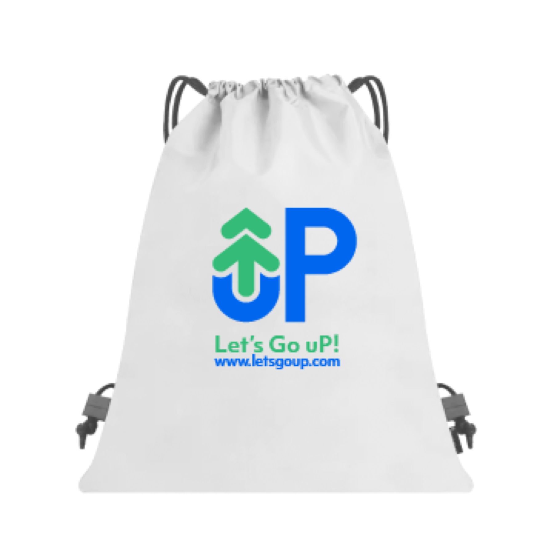
Drawstring bags and stress balls
The internal merchandise run, handed out to staff and at events.

uServe trade show backwall
uServe was the group’s point of sale product, and the trade show stand was where most people met it for the first time. I built three backwall configurations so the booth could lead on a different part of the product from show to show without the whole thing being redesigned each time.


UP Promo Video
I creative directed this and a freelancer produced it. My part was the visual direction: how the mark, the color, and the type act in motion, and how content is visually presented. The content itself was provided by other members.
UP x Secretlab
After the identity landed, Universal Processing’s CEO put us in touch with a friend of his, Secretlab’s CEO, and their chair design team. The result was a chair in the new identity for the new office building.
The brief pulled in two directions. A room full of these had to read as one company, without being too loud with the new bright palette.


